pivot tableのcolumn, rowのsort

python
前処理
Author

Ryo Nakagami

Published

2025-02-20

問題設定

Exercise 1

Code
import numpy as np
import pandas as pd

np.random.seed(42)

def random_choice_from_list(
    candidate: list | np.ndarray,
    sampling_size: int,
    p: list | tuple | np.ndarray = None,
):
    if sampling_size <= 0:
        raise ValueError("sampling_size must be greater than 0.")

    if p is None:
        p = np.repeat(1 / len(candidate), sampling_size)

    if min(p) < 0 or max(p) > 1:
        raise ValueError("All probabilities in 'p' must be between 0 and 1 inclusive.")

    if not np.isclose(sum(p), 1):
        raise ValueError("The probabilities in 'p' must sum to 1.")

    return np.random.choice(candidate, size=sampling_size, p=p)
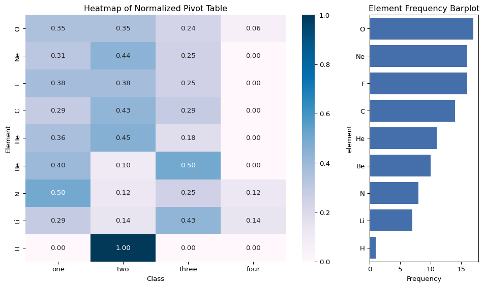
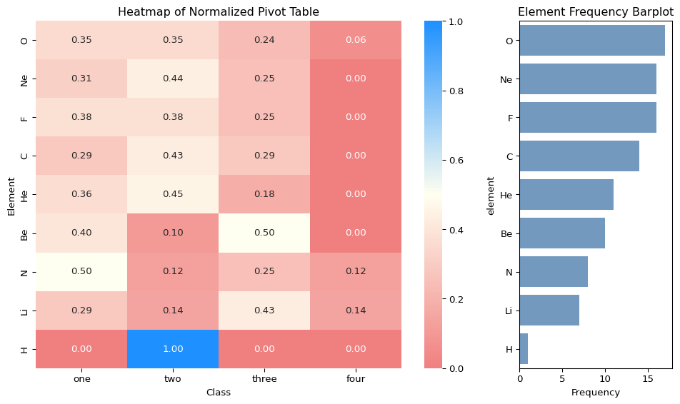

# Params
N = 100
A_list = ["H", "He", "Li", "Be", "B", "C", "N", "O", "F", "Ne"]
A_prob = np.array([1, 4, 3, 4, 1, 6, 7, 8, 9, 10])
A_prob = A_prob / sum(A_prob)

B_list = ["one", "two", "three", "four"]
B_prob = np.array([7, 8, 6, 1])
B_prob = B_prob / sum(B_prob)


# DGP
df = pd.DataFrame(
    {
        "element": random_choice_from_list(A_list, N, A_prob),
        "class": random_choice_from_list(B_list, N, B_prob),
        "density": np.random.uniform(0, 1, N),
    }
)

df.head()
element class density
0 N one 0.642032
1 Ne two 0.084140
2 F one 0.161629
3 O two 0.898554
4 Be three 0.606429

▶  問題設定

Solution with pandas

Task 1: (element, class) をkey,frequencyをvalueとした二次元分割表を作成する

pandas.pivot_tableを用いればかんたんに実行できます.

Code
# Compute the pivot table
pivot_table = pd.pivot_table(
    df,
    index="element",  # Rows
    columns="class",  # Columns
    aggfunc="size",  # Frequency count
    fill_value=0,  # Fill missing values with 0
)

pivot_table
class four one three two
element
Be 0 4 5 1
C 0 4 4 6
F 0 6 4 6
H 0 0 0 1
He 0 4 2 5
Li 1 2 3 1
N 1 4 2 1
Ne 0 5 4 7
O 1 6 4 6
Task 2: 二次元分割表をcolumn, rowそれぞれの方向について,合計frequencyに基づいたsortを行う

pivot table化された pandas.DataFrame に対するソート操作は

  • row操作 ; .loc のindexの操作
  • column操作: .loc のcolumnの操作

となります.

▶  rowのsort

Code
pivot_table = pivot_table.loc[
    pivot_table.sum(axis=1).sort_values(ascending=False).index
]
pivot_table
class four one three two
element
O 1 6 4 6
Ne 0 5 4 7
F 0 6 4 6
C 0 4 4 6
He 0 4 2 5
Be 0 4 5 1
N 1 4 2 1
Li 1 2 3 1
H 0 0 0 1

▶  columnのsort

Code
pivot_table = pivot_table.loc[:, pivot_table.sum(axis=0).sort_values(ascending=False).index]
pivot_table
class one two three four
element
O 6 6 4 1
Ne 5 7 4 0
F 6 6 4 0
C 4 6 4 0
He 4 5 2 0
Be 4 1 5 0
N 4 1 2 1
Li 2 1 3 1
H 0 1 0 0

▶  検証

Code
pivot_table_total = pivot_table.copy()

# row sum
pivot_table_total['total'] = pivot_table_total.sum(axis=1)

# column sum
pivot_table_total.loc['column_sum'] =  pivot_table_total.sum(axis=0)

# 検証
pivot_table_total
class one two three four total
element
O 6 6 4 1 17
Ne 5 7 4 0 16
F 6 6 4 0 16
C 4 6 4 0 14
He 4 5 2 0 11
Be 4 1 5 0 10
N 4 1 2 1 8
Li 2 1 3 1 7
H 0 1 0 0 1
column_sum 35 34 28 3 100

Visualization

可視化方針

  • class出現割合はelement毎に大きく異なるのかみたい
  • frequencyそのままで比較すると出現割合比較にならないので,axis = 1の方向で割合として計算する(以後,normalized_pivotと呼ぶ)
  • normalized_pivotをheatmapで可視化する,可視化の際に出現頻度を右側に参照できるようにする(sample sizeが小さいところは無視したい)

▶  normalized_pivot の作成

Code
normalized_pivot = pivot_table.div(pivot_table.sum(axis=1), axis=0)
normalized_pivot
class one two three four
element
O 0.352941 0.352941 0.235294 0.058824
Ne 0.312500 0.437500 0.250000 0.000000
F 0.375000 0.375000 0.250000 0.000000
C 0.285714 0.428571 0.285714 0.000000
He 0.363636 0.454545 0.181818 0.000000
Be 0.400000 0.100000 0.500000 0.000000
N 0.500000 0.125000 0.250000 0.125000
Li 0.285714 0.142857 0.428571 0.142857
H 0.000000 1.000000 0.000000 0.000000

▶  可視化コード

Code
import seaborn as sns
import matplotlib.pyplot as plt

# Plot heatmap
fig, ax = plt.subplots(1, 2, figsize=(10, 6), gridspec_kw={"width_ratios": [3, 1]})

sns.heatmap(normalized_pivot, annot=True, fmt=".2f", cmap="PuBu", ax=ax[0])
ax[0].set_title("Heatmap of Normalized Pivot Table")
ax[0].set_ylabel("Element")
ax[0].set_xlabel("Class")

sns.barplot(
    y=pivot_table.index,
    x=pivot_table.sum(axis=1),
    alpha=0.8,
    color="#0047AB",
    orient="h",
    ax=ax[1],
)
ax[1].set_title("Element Frequency Barplot")
ax[1].set_xlabel("Frequency")

plt.tight_layout()
plt.show()

🍵 color mapのカスタマイズ

color sequenceをlightcoral, ivory, Dodgersblue という順番にしたい場合は

Code
from matplotlib.colors import LinearSegmentedColormap

custom_cpam = LinearSegmentedColormap.from_list("lightcoral_ivory_blue", ["#F08080", "#FFFFF0", "#1E90FF"])

とすることで自分好みにカスタマイズすることができます.

Code
# Plot heatmap
fig, ax = plt.subplots(1, 2, figsize=(10, 6), gridspec_kw={"width_ratios": [3, 1]})

sns.heatmap(normalized_pivot, annot=True, fmt=".2f", cmap=custom_cpam , ax=ax[0])
ax[0].set_title("Heatmap of Normalized Pivot Table")
ax[0].set_ylabel("Element")
ax[0].set_xlabel("Class")

sns.barplot(
    y=pivot_table.index,
    x=pivot_table.sum(axis=1),
    alpha=1,
    color="#6699CC",
    orient="h",
    ax=ax[1],
)
ax[1].set_title("Element Frequency Barplot")
ax[1].set_xlabel("Frequency")

plt.tight_layout()
plt.show()